 Ondina Frate
TITLE: MIT Media Lab, Copyright MIT ©
CATEGORY: Data Visualization, Product Design, UX/UI, Portal Integration
DATE: January 2022
TOOLS: D3, Figma
COLLABORATORS: Team of Designers and Engineers
DESCRIPTION:
The underlying statement for this project was - How can we give a voice to underrepresented communities in Boston? Our goal was to represent this through a website that included a visualization and to make this website accessible for everyone.
URL: RTFC Visualization
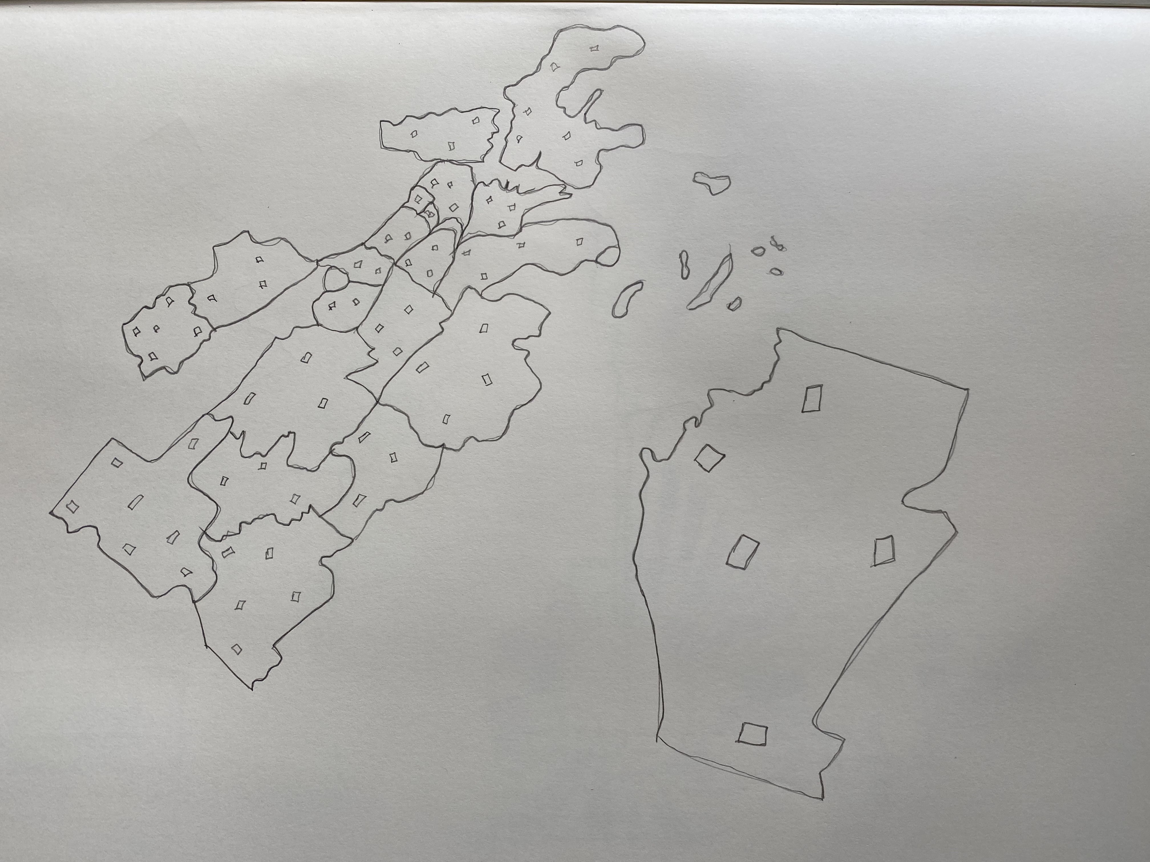
The first thing I did was to draw Boston’s map to check from which neighborhoods are these speakers. Does wealth play a big role in where these issues are happening? I was trying to figure it out what is the data telling me.
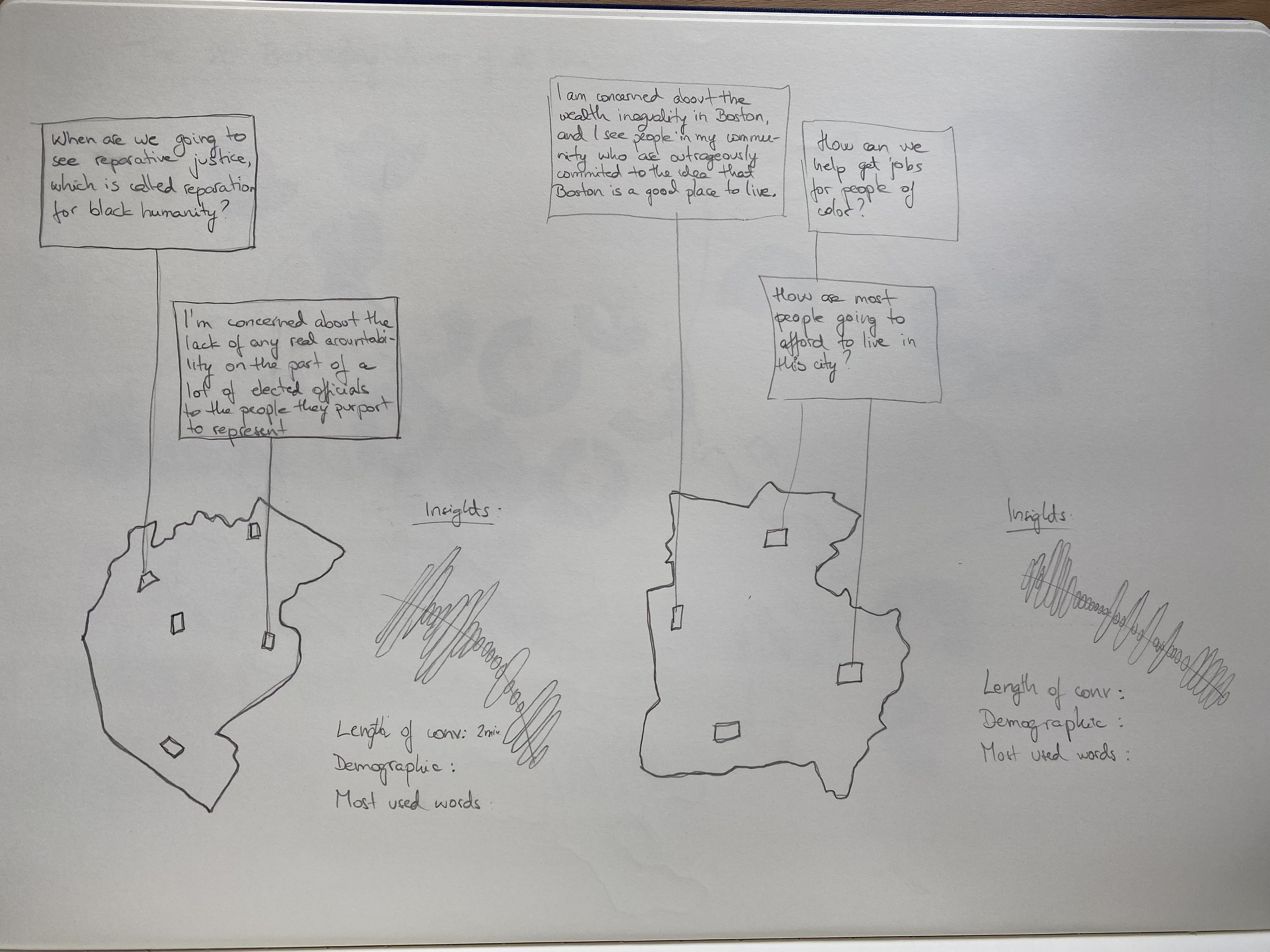
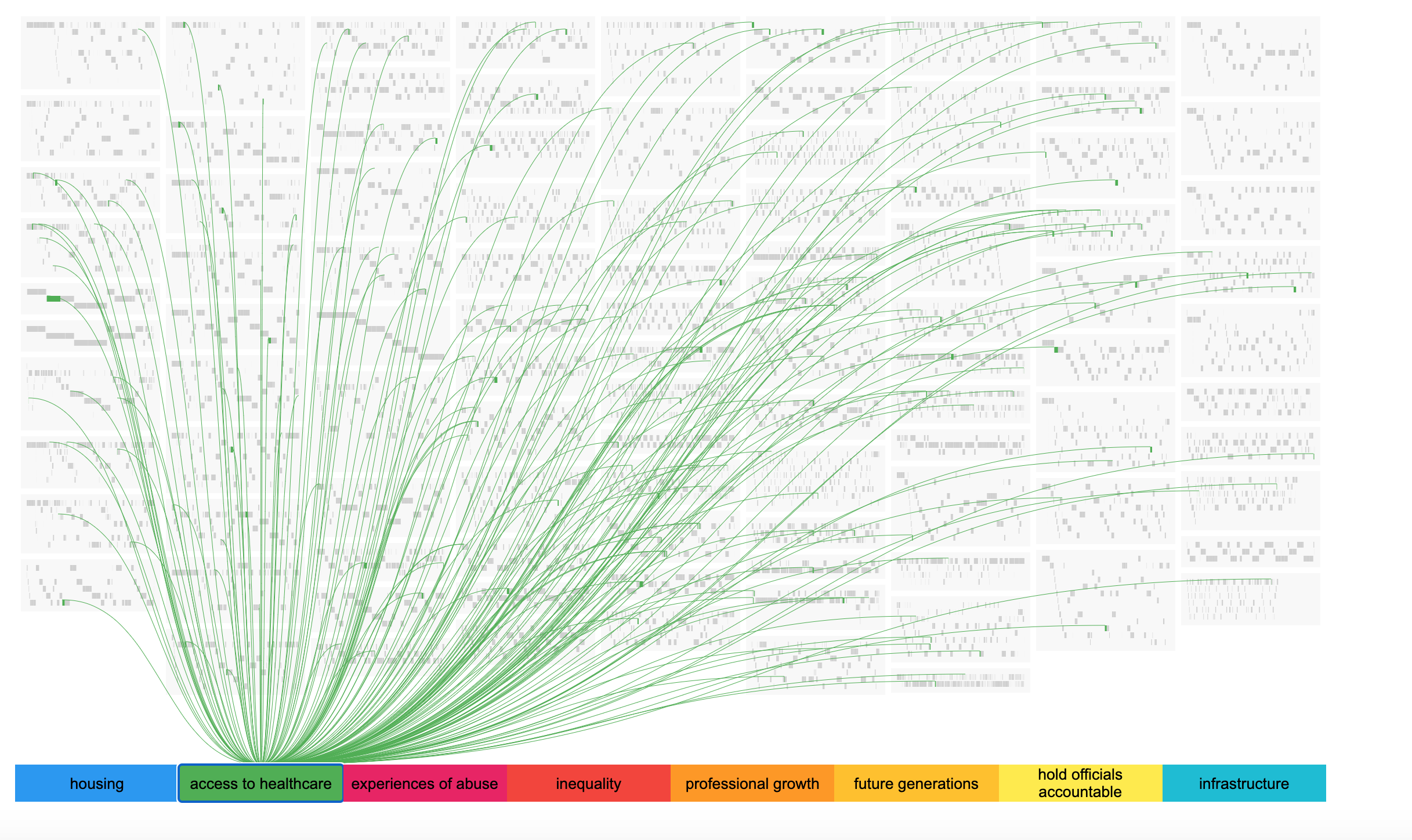
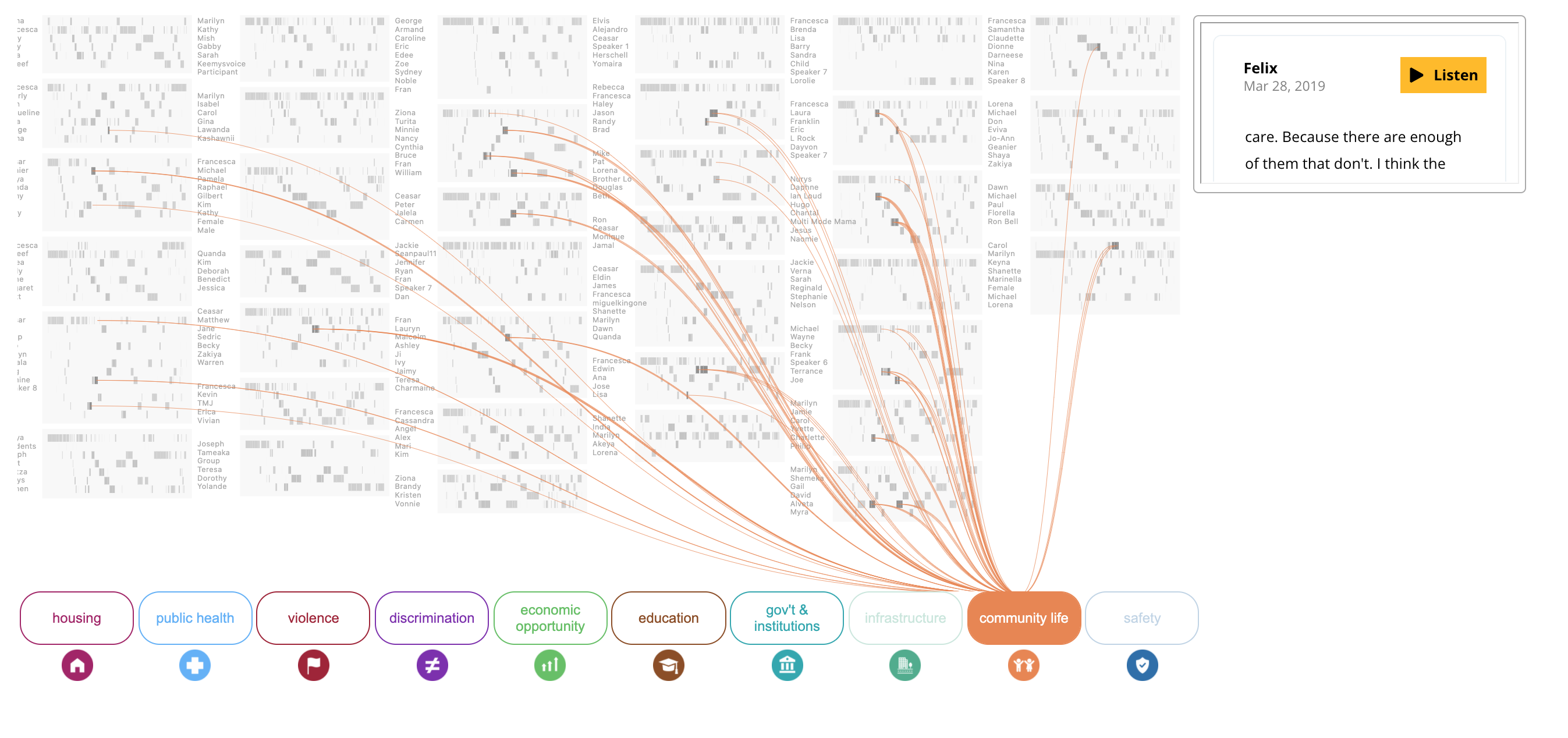
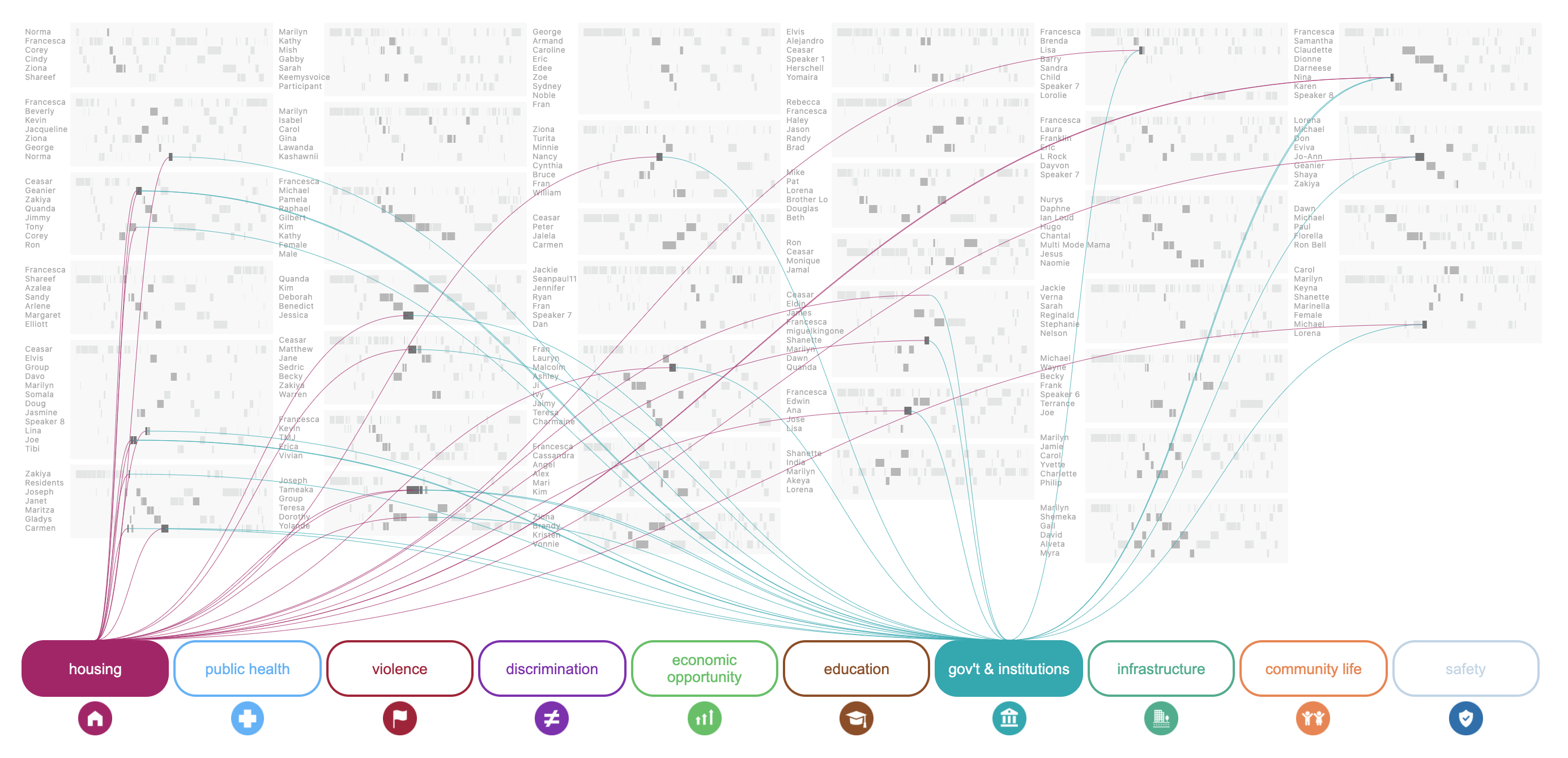
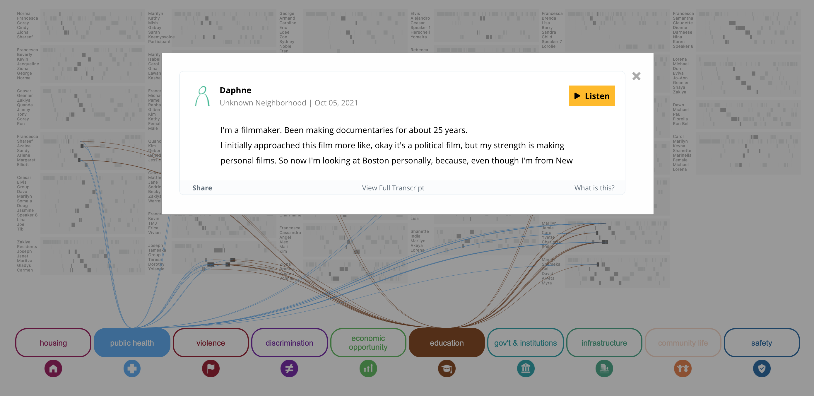
Then I started sketching how this visualization would look like. I started thinking of the most used themes throughout these conversations and how can I visualize them. I thought of the most used words in these conversations, but I realized that wouldn’t be an accurate representation of this data.
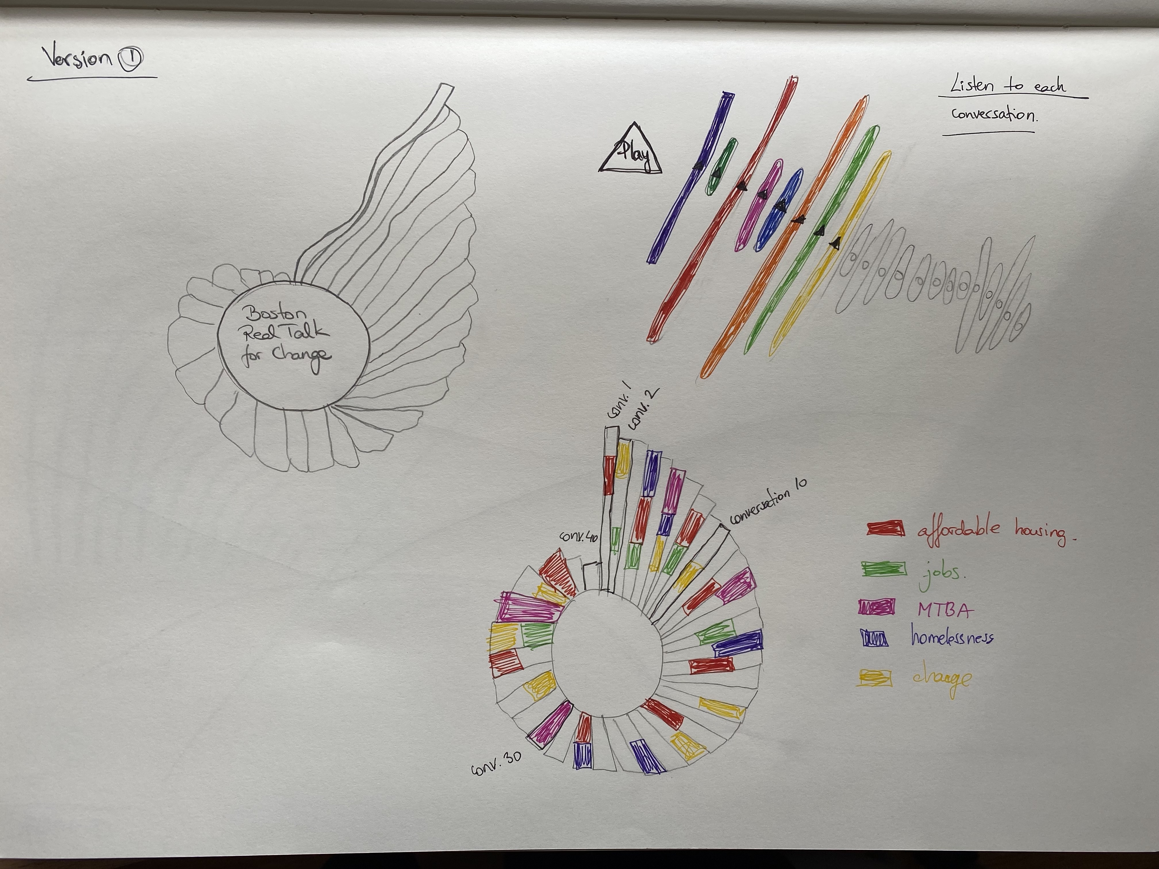
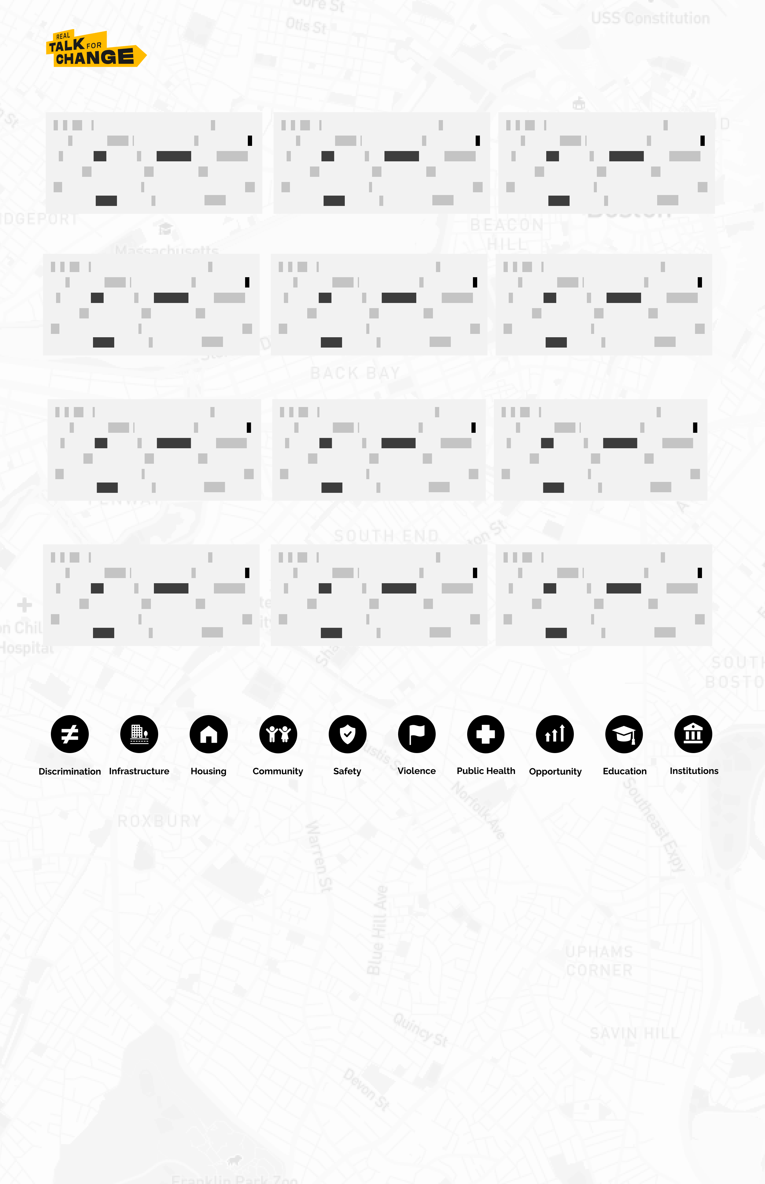
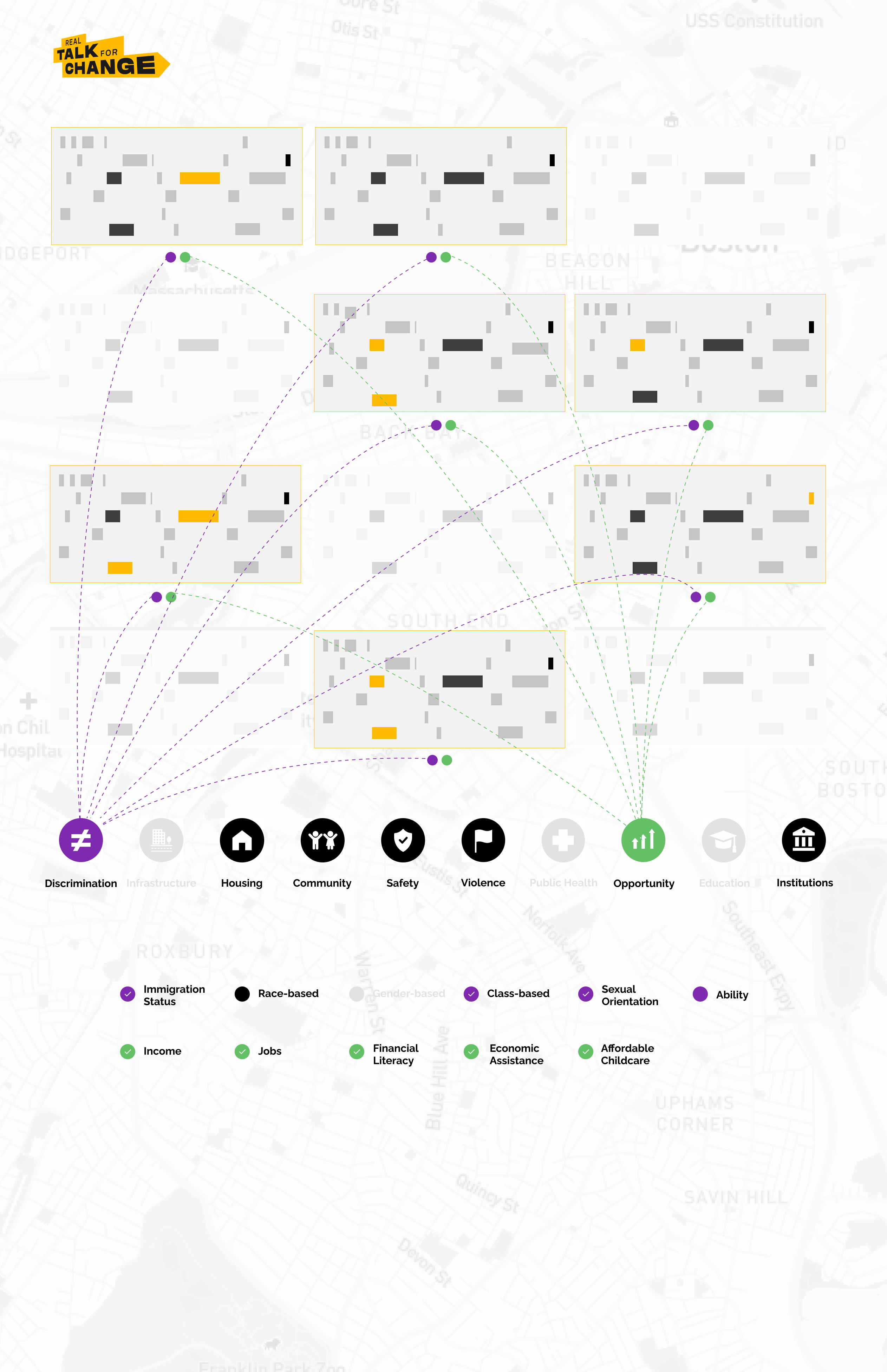
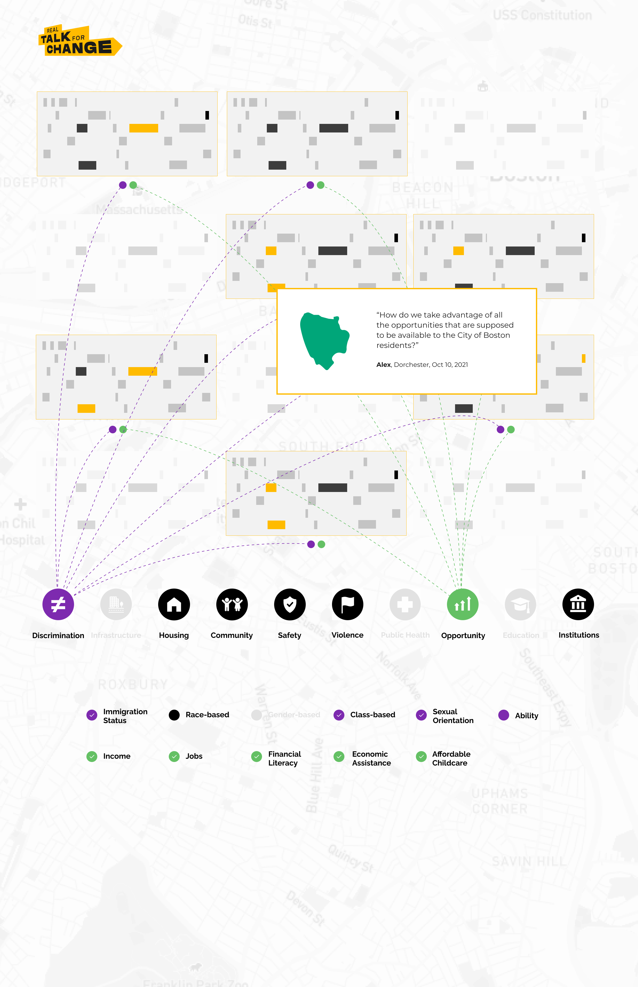
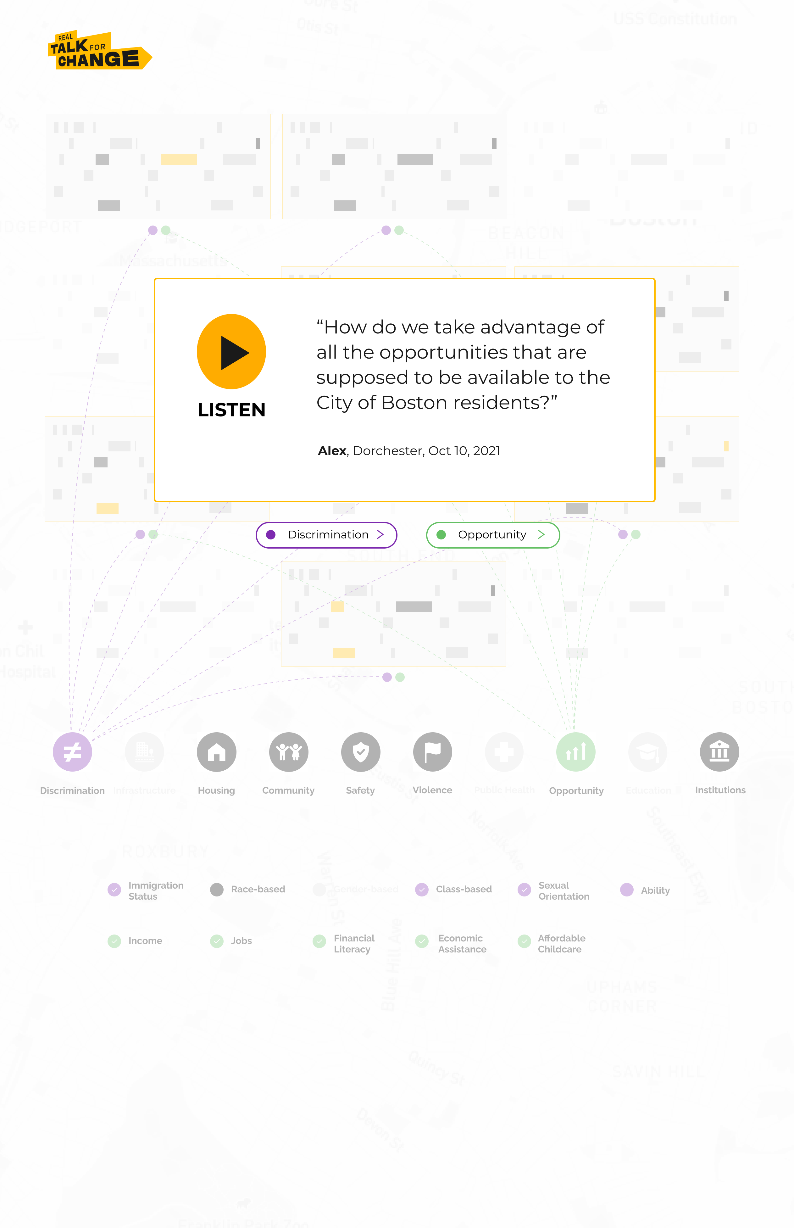
Then I thought of designing a lot of rectangles where each meant one conversation and the lines show how these conversations are connected to each other. Each little highlighted rectangle represents a specific theme that was found in those conversations. This design that got chosen to be implemented because it showed our audience the total amount of the conversations and it allowed users to see an overview of all the main issues.
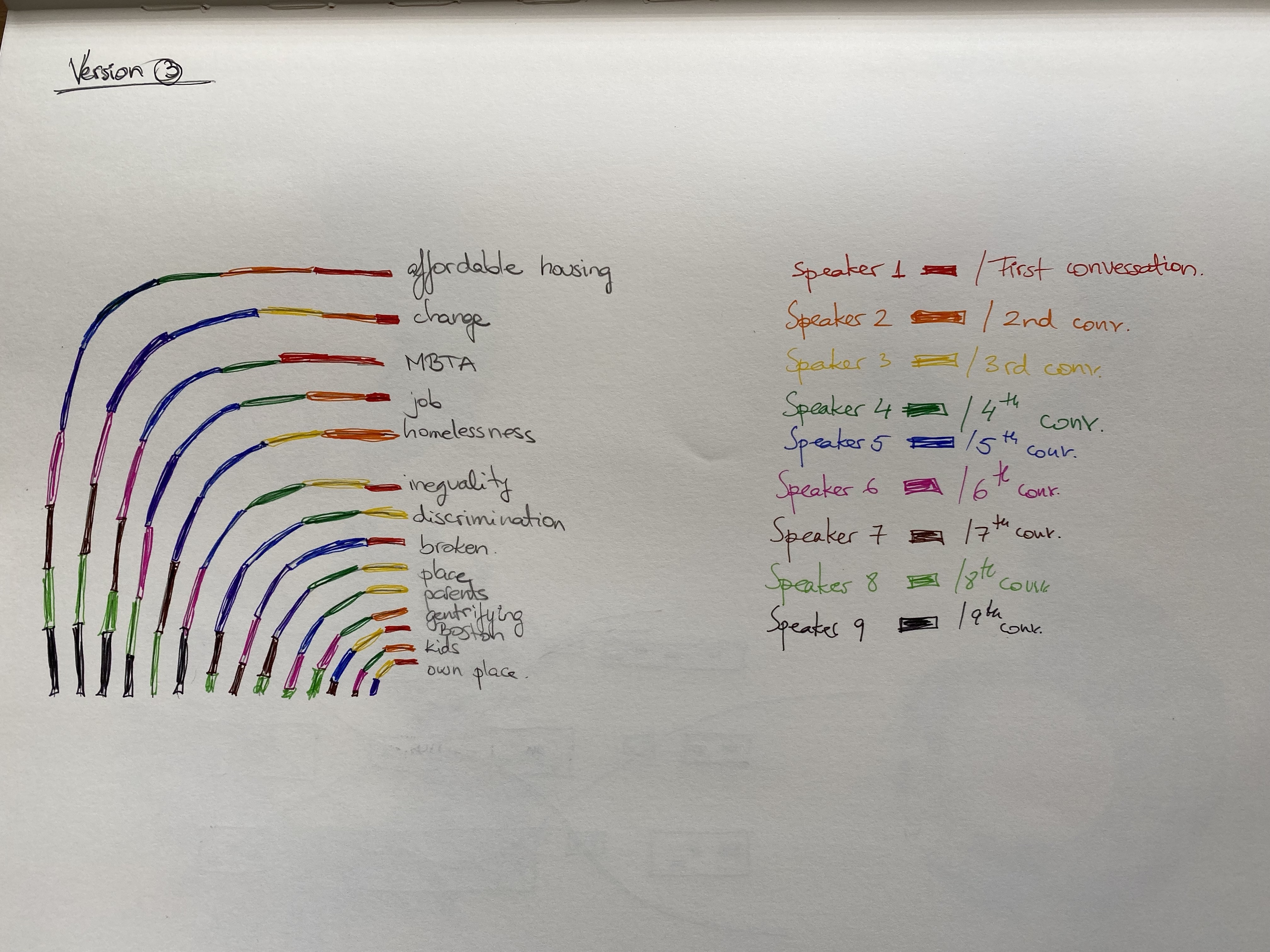
These are some of the initial mock-ups that we created to collect feedback.
RTFC Data Visualization
RTFC Portal