 Ondina Frate
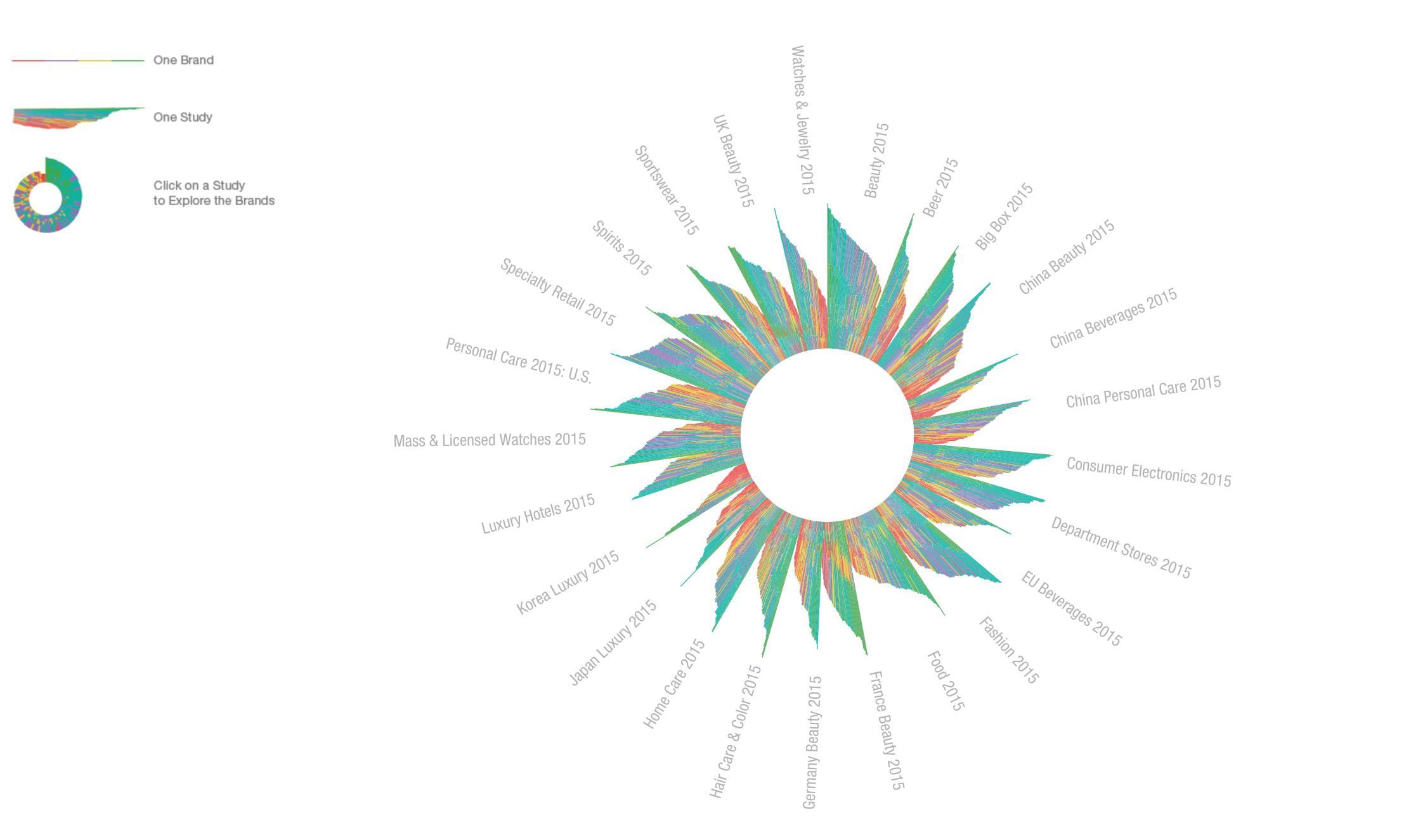
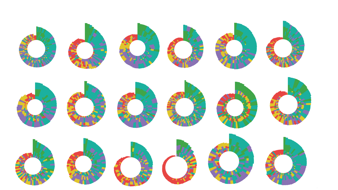
TITLE: Nautilus
CATEGORY: Data Visualization
DATE: August 2016
TOOLS: D3.js, MySQL
COLLABORATORS: None
DESCRIPTION:
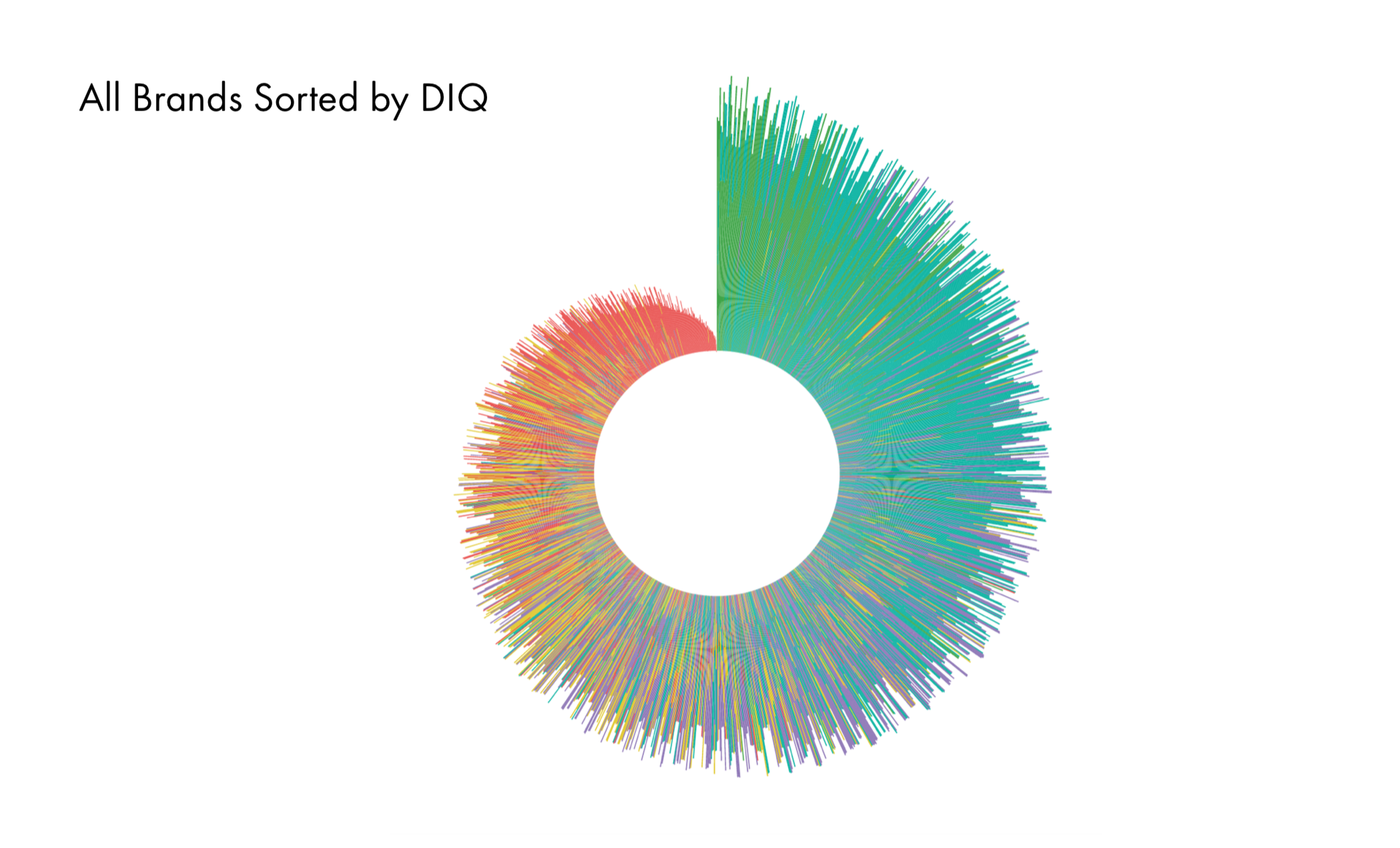
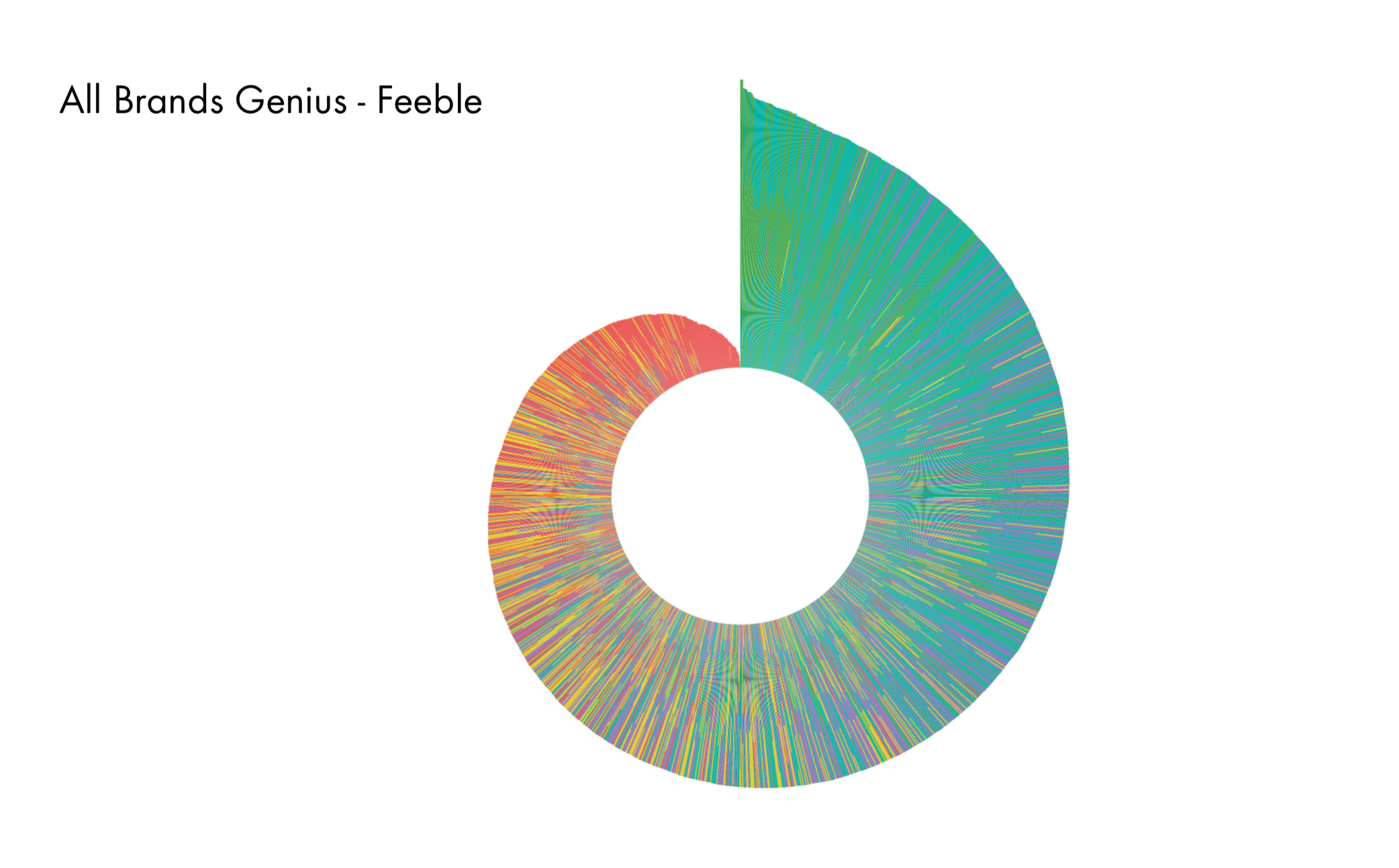
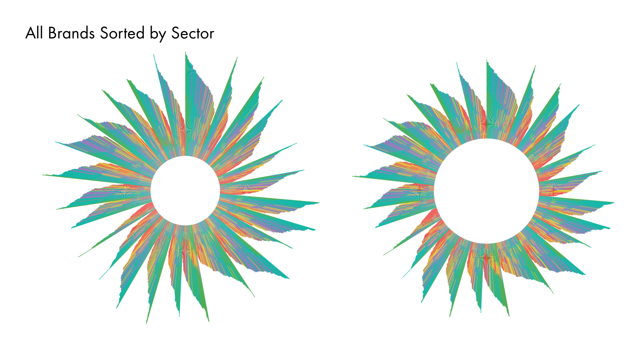
'Nautilus' is a data visualization using D3 that I did while working at L2.Inc, showing their digital IQ brands. The green color represents a genius brand, while red means feeble. The more green and higher values one brand has, the better it is. This visualization helps brands see their high or low ratings in comparison to their competition brands, depending on the sector.
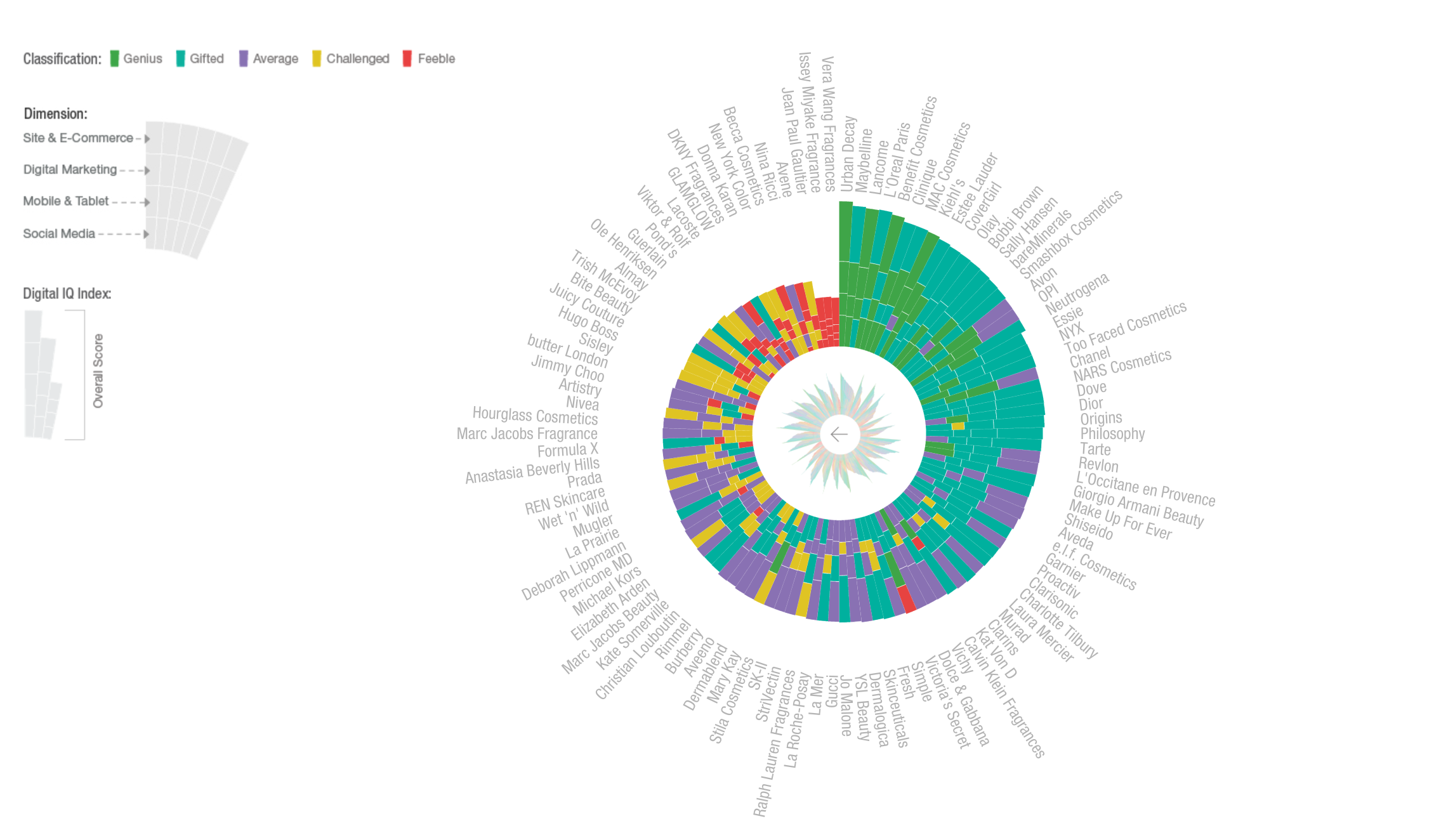
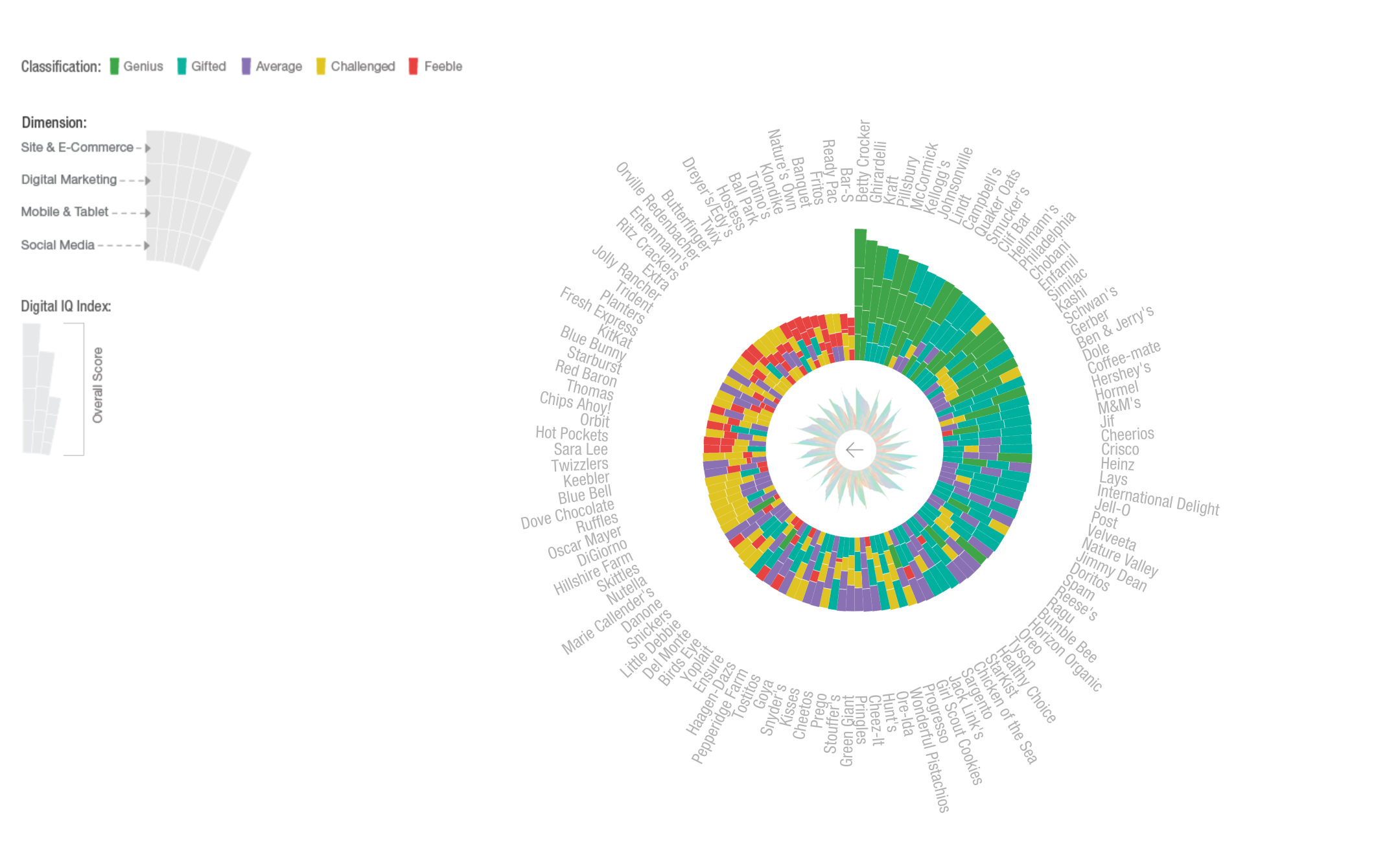
Check out the project live on the L2's page
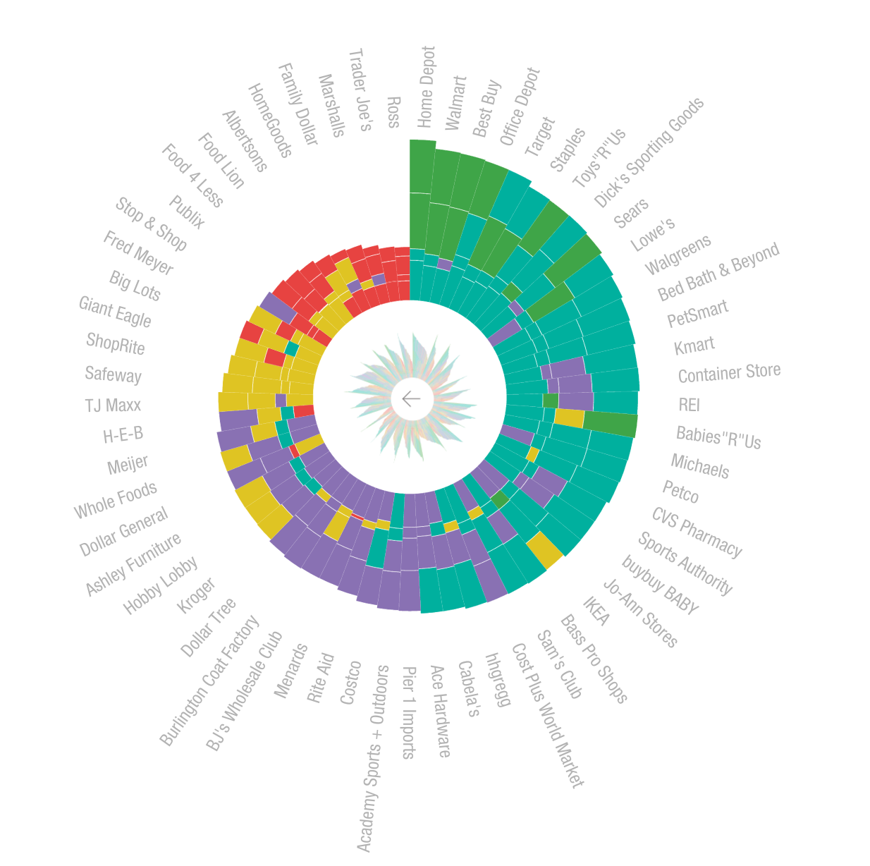
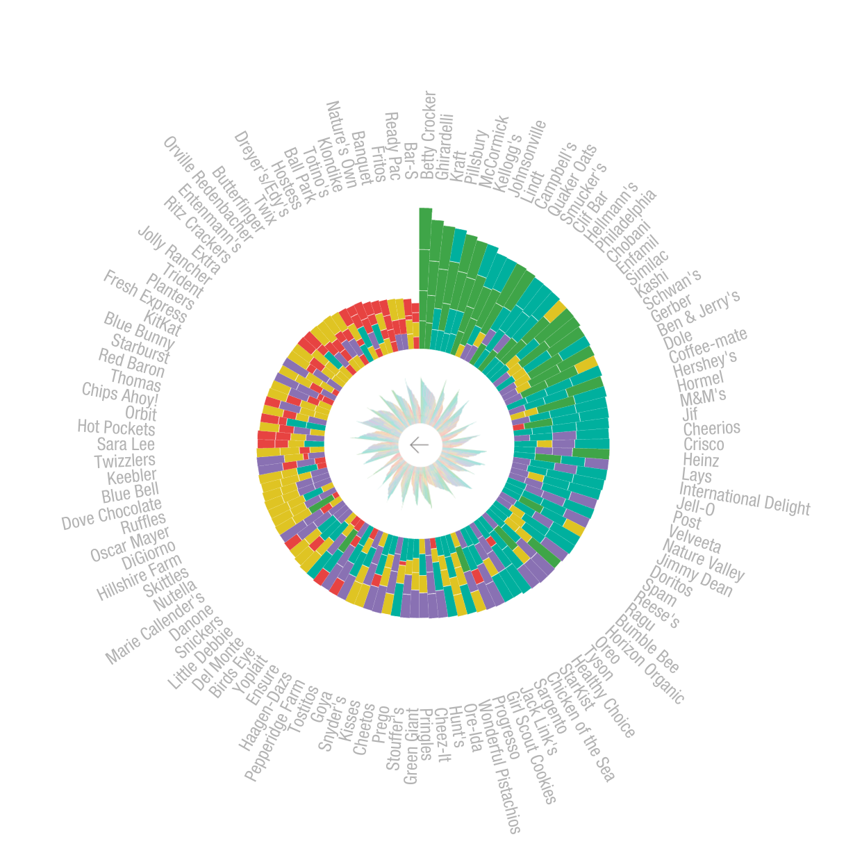
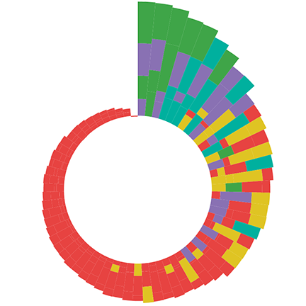
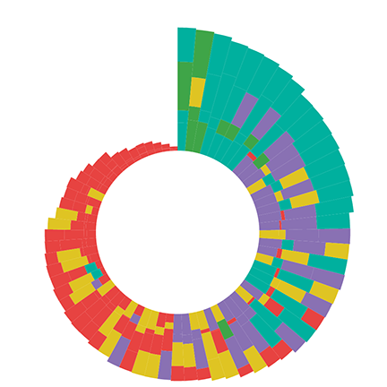
ITERATIONS FOR 1800 DATA POINTS
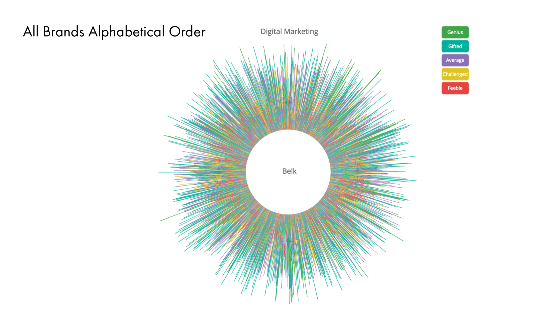
NAUTILUS FINAL PROJECT